Phonearl
Good start, but then it gets ruined
KnotStronger
This is a must-see and one of the best documentaries - and films - of this year.
Frances Chung
Through painfully honest and emotional moments, the movie becomes irresistibly relatable
Cheryl
A clunky actioner with a handful of cool moments.
Ersbel Oraph
The maker wanted to so something new, something different. And it is so nice that the employer allowed this experiment. And that is about it.Maybe if the whole thing would have been 20-35 minutes long it would have been wonderful. But there is way too much space filler. So either that is bad planning by shooting too little or somebody was too attached to the footage that nothing could be dumped.Amusingly the story has no apparent structure, yet there is a clear and conventional ending. And the interviews seem to be thrown in as some of the speakers are against Helvetica usage, while most are in favor, but the selection criteria is not obvious to me.One argument this is plain bad work: there is a lot of talk of design, yet there are lots of pictures sliding in with logos written in Helvetica. This all looks like a silly advert from the 1980s. The purpose seems to be something along the lines of "you have to be initiated in order to see it".Still, I had a good laugh with the German designer calling the Swiss militarists (german joke, I know) and telling with a straight face how he is always late, one year late, but to the second.Bottom line: if you are curious about Helvetica and have two hours to waste, knock yourself out. Otherwise, this is a total waste of time.Contact me with Questions, Comments or Suggestions ryitfork @ bitmail.ch
gavin6942
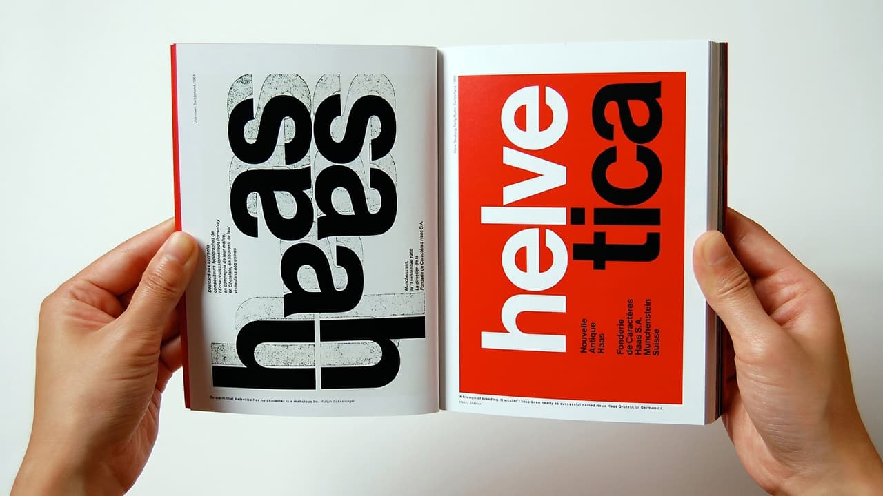
A documentary about typography (including but not limited to the Helvetica font), graphic design, and global visual culture.So, you might wonder how 90 minutes about a font could be interesting. That must be among the most boring things in the world, right? Not at all. We learn about the whole story of modern typography, and how hard it used to be to design a single letter.We learn that there is a political message to letter shape choices -- to one woman, Helvetica is the font associated with the Vietnam war (and also Iraq). We get a certain feeling from different shapes, and this is one of them.One man asks, is there a science of aesthetics that explains why this font is the perfect one? Why no one has been able to improve on it in 50 years? I find that an interesting question. No math went into designing it, but somehow it has an intrinsic style that seems to be the way we now view language.
bob the moo
As many others have already said – a documentary film that appears to be about the font Helvetica (or indeed any font) is hardly something that is screaming out to a wide audience or likely to be screening to packed crowds in the American heartlands. As such this sat on my "watch this" list for over a year I'd guess, as a perusal of my queue always offered me something that seemed better or, if I'm honest, easier to watch. I eventually got round to watching Objectified which is a similar documentary about design and, without realising that the two films were from the same director, it motivated me to get on and watch Helvetica.Like Objectified I found that the film did a great job of laying out the topic in a clear and accessible manner. It builds a very effective and engaging discussion on the font in particular but also the wider arena of graphic design and typefaces that are all around us. The structure of the film is the foundation that makes it work – it doesn't jump into the deep end of the topic and it manages to be suitable for the casual viewer (which I am) while also avoiding being patronising to those that work in this sector. This is the groundwork and it is well built on by the selection and use of a very good collection of designers and experts in the field – almost all of whom are passionate, well spoken, interesting and, most importantly, not "up themselves" or self-important in the way that some of those in design or art can be.These talking heads help the film maintain an open, accessible approach while the visual design and packaging of the film itself keeps everything lively for the eye and the ear as well – never going into the realm of a dry academic approach to the topic. So yes, Helvetica may sound like it is going to be a very niche film and as much fun as a holiday slideshow from a dull uncle but it is actually light, accessible and engaging due to the structure and design of the film and a great selection of contributors.
lastliberal
There was a time when I was editor, publisher, and writer of a small newspaper in Spain. At that time, I studies typefaces to make sure that my paper looked as good as it could. In light of that I was interested in this documentary about the most popular typeface designed.Helvetica has been around 50 years, and is the "default" type according to Erik Spiekermann, who really gives an exciting discussion of the type.Many others chime in on the pros and cons of Helvetica. It is a fascinating journey into design. Exploring where we have been and where we are going in even the simple areas of life helps us understand who we are.